Monday, October 11, 2010

The Don’t-Buy/Sold List

My Don’t-Buy/Sold list performed in line with S&P 500. I had the habit to keep tabs on the stocks I looked at but didn’t buy as well as the stocks that I sold. There are 63 of them on the list today. A reckoning shows that they performed in line with S&P 500 for the last twelve months, if equally weighted. In other words, my sell list has been a waste of time.

Going through the list, I wouldn’t have guessed it. If I had to make a prediction, the list upended would be more like it. The one that tripled is HWK, a friction material company.

image

Lessons Learned:

The Market seems to overvalue growth, or grant premium on certain stocks. If a stock grows at above market average, the market would value it at more than I consider it should be. Sometimes the P/E would shoot up to above 30X, or even 50X if the stock is really hot. I have not learned on how to play with those types. The takeaway is that hyper-valuation alone is not a good reason to sell—hold on to the choppers until there’s reason not to. Of course, it would be difficult to get out right on time.

Sold too early for lack of patience, valuation, or bad news. There are several stocks I sold, when it stopped moving for a while, or moved too much than expected, or when there’s bad news and selloff. Those several outperformed the S&P 500 30% plus afterwards. The motto is not to fret about short-term performance, but to recheck the thesis—easier said than done. Bad news could be opportunities to buy more. Of course, the turnaround may come really slow.

Fear would keep you from the best opportunities. I have missed several REITs that doubled. Looking back, I was overloaded with concerns on the sector—after all it was the epicenter of all the problems. But it turned out that it was one of the best places to be. Of course, I may well have had been trying to catch a falling knife.

Valuation would go nuts for no particular reason. There are ones without much earning growth, on an average growth forecast, but the price just went through the roof. Is there anything someone knows but I don’t? This is when you don’t learn.

Friday, October 8, 2010

Portfolio Notes, Oct 2010

The Economy

The world economic growth is experiencing a so-called decoupling, with a tepid growth in the U.S. and Europe recovering from the financial crisis, but a higher growth in emerging countries, particularly India and China.

The inflation of the emerging market is picking up, for a complicated basket of reasons, including a closing output gap and increasing price of food, which is a good portion of consumption in the emerging world. For the developed world, the inflation is low, or too low in the U.S., considered by the Fed.

Fiscal deficits increased across the globe as a result of the stimulus packages. The Euro area shows a debt/GDP ratio of 80%, up from 65% at the beginning of 2008. Those of Greece, Ireland and Italy reached close to 100% of GDP, well above the 60% level commonly considered acceptable. Losses in the asset market deteriorated pension funds, further adding to the fiscal pressure.

Unemployment rate is sky-high, especially in the developed countries hit hard during the crisis. The reverse would take two years at least or longer given the lukewarm growth.

U.S. housing price stabilized at 25% below peak of Case-Shiller Index, a level that still makes default rational.

The U.S. private sector is deleveraging to repair the balance sheets. The U.S. household sector has reduced debt for 9 consecutive quarters—it never did since 1976 until this recession, having always growing at 5%-12% range annually. In amount, it was borrowing at $1 trillion annual rate from 2003 to 2007, now at $-300 billion.

Rates

Policy rates are at record low globally and going ZIRP at major economies.

We are in the phase II of QE, after the Fed, ECB, and other central banks have dramatically expanded their balance sheets during round one. BOJ just went out purchasing everything including even REITs. The Fed has already hinted and the market widely expects it to be the next, rolling out QE II in November. ECB seems would not join the action.

Currencies

USD has kept going down against other currencies, during the so-called currency war. In my opinion, the weakness of USD comes from low rates in the U.S., QE, and weak growth of the U.S. economy.

JPY has been surprisingly strong, due to weak USD, anecdotal pulling back of domestic investors, and diversification of Chinese foreign reserve. After a small-scale intervention to no avails, the Japanese authority is hoping the recent QE would ease the export pressure on the ailing economy.

EUR is strengthening, on the relative unwillingness of the ECB for another QE.

Emerging currency basket is going up against USD, mounting pressure on current accounts, inflation and growth.

Portfolio

Key Theme: EM growth, monetary expansion, weakening USD, if-slow recovery instead of double-dip

All stocks, since low 10Y rates everywhere, closing spreads, and no seen risks of a double-dip.

Buy Russia, for: good value/energy concentration; against: the reason for low valuation is unclear.

Buy India, for: long-term growth story; against: a possible rate hike to curb inflation?

Buy Peru, for: commodities, capital inflows; against: ?

Buy Korea, for: good value; against:?

Buy Malaysia, for: huge current account surplus, energy focus; against: ?

Buy oil stocks, commodity stocks, for: QE, weak USD, recovering IP; against: reversing USD, rate hikes, unfavorable economic data, historically high inventory

Buy gold stocks, for: QE and weak USD; against: reversing USD, rate hikes, market correction

Buy tech, auto, industrial, financial stocks, for: cyclical recovery; against: weak economy/housing

Watch Ireland, for: at trough, possible upside risks

Key Risks/Questions

What if the Fed’s QE is perceived to be of a lesser scale than expected, or economic data disappoints after QE II?

What if higher commodity prices add pressure to the inflation?

What if for some reason USD reverse course?

What if one of the EU countries defaults on its sovereign?

Friday, September 17, 2010

A Flow of Funds Analysis of the Housing Bubble

Some facts gleaned from the Federal Reserve’s Flow of Funds Accounts (the Z.1 releases) on the housing bubble.

image

An obvious credit boom, in hindsight

There was clearly a credit bubble, as shown in the above figure that depicts the flow of funds of the Financial Sectors, starting in the middle of the last decade, right before it imploded into the still-lingering financial crisis.

A massive leverage-up could be seen on the aggregate balance sheets of the financial institutions. The total net lending of the financial system ranges around $500 billion annually from 1985 to 2001, fluctuating along the business cycles. From 2002 on to 2007, however, the amount of lending suddenly shot up to $2,200 billion annually. 

All excess went in mortgages

Almost all the abnormal, “excess” lending went into the mortgages, which trended upward by $1 trillion per annum. Just think about the amazing phenomenon of such scale and efficiency for a moment: somebody have been churning out mortgages in whatever manners for an additional $30 billion per day, over 100,000 medium-priced houses worth.

Source of funding remained an interesting issue

So where did all the money, over $1 trillion per year, come from? It had to be somewhere.

An item-by-item review showed that the major source of funding seemed to be time & savings deposits, up $350 billion from previous period, and GSE-backed securities and bonds issued by financials (probably ABS issuers, as we will see later), which made up another $400 billion, and whatnot.

Types of funding sources being clear, you still have to wonder who purchased all those securities that made up the liabilities site of the mortgage binge. And the time & savings deposits?

A collaboration of banks, GSEs and ABSs

image

Banks, GSEs and ABS issuers accounted for 1/3 each in the trillion-dollar mortgage production line in 2002-2007. All came out with significantly higher productions/holdings of mortgage assets than previous, almost seemingly orchestrated. The production lines must be worth looking at.

The doomed crash would have dried up the mortgages, if w/o intervention; Financial crisis ensued

The reverberation of the destined crash has been much written about and could be easily imagined, particularly with hindsight.

Key Takeaways

Modern financial distribution network is highly efficient; A credit bubble would come out of nowhere, and there’s no obvious workable policy responses to prevent it from happening again unless cool heads prevail; A bursting bubble, usually sudden and vehement, is no fun. It is a wealth destructor collectively, although someone got rich from it.

Sunday, August 22, 2010

Port Notes: HAMP@$4, buy

image

A sweater company—$5 per share in cash, $7 in equity, debt free. Traded $4 per share. Yes, probably would lose a bit this year.

A tiny company, though not tidy—a lot of stuffs going on. See the filings.

Anyway, 75c for $1, and then some last year’s sweaters.

Pink sheet. Illiquid.

Port Notes: FR@$4.51, buy

image

image

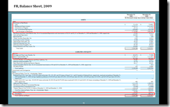
First Industrial holds and rents a portfolio of industrial properties—factories, warehouses, etc. The book value of the properties was $2.7 billion, financed partly by $2 billion debt. The book equity was $1 billion, or 3X market value. There was unexpectedly no write-downs in assets.

image

Cheap as it is, what’s interesting is its profit model. As the I/S shows, in recent years it had scant gains from the renting business. Instead, all its profits came from selling properties for higher prices.

image

It rolled over 30% of its properties and made $250 million from price appreciations, and 20% for $180 million. Such an earning stream stopped in 2009 together with a single-digit drop in rent revenues, pulling the company down into read.

CRE usually lags and its bottoming is hard to predict.

If you want to buy its shares, it would be the very reasonable price. If the valuation recovered to only half of current book value—not a scenario unthinkable—the stock would jump 40%.

Cash from operations would be positive before the revenue is cut by half.

Saturday, August 21, 2010

Port Notes: BLD@1.37, Buy

image

Buy this one for some short-term profits.

Baldwin Technology manufactures cleaning, fluid & temperature management hardware for the printing industry. It’s a global company—50% sales in Europe, 25% America, 25% Asia and Australia. It usually earns $6 or 7 million before the recession. In 2009, it lost $12 million. After a restructuring, it turned profitable again for the first nine months in 2010, earning $3 million.

Now the industry it serves is declining, since printing media is being replaced by the online. Still the stock is cheap—at $21 million in market cap, or 6X earnings—and its cost cutting has worked, at least for the short term.

Buy it at current price of $1.37 per share and sell at $1.7 later, for a crispy 30% gain in what could be several months. It may as well go down to $1—if so, hold on to it.

Friday, August 20, 2010

Port Notes: ACY@14.72, Buy

image

Here’s a good one.

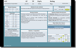
AeroCentury is a leasing company that purchases aircrafts and aircraft engines and leases them to international regional airlines. It’s $125 million portfolio includes Fokker/de Havilland/Saab aircrafts, and some GE engines.

I used Net Income + Depreciation as a proxy for operating cash flow, and it leads to 8-10% return on leasing assets. After levering up with $72 million debt, the rate of return is around 30%.

The company has zero employees—it’s a first—since it outsourced the management to JMC.

It trades at about half book value and it’s profitable.

There’s some complexity in financing schemes.

Before buying, you need to figure out what would happen if there is an interest rate hike.

Port Notes: ADUS@$4.94, Don’t Buy

image

I’ve come across several “corporate pensioners,” whose sole providers are the government. Some are with the military industrial complex, others produce vaccines for stock-piling.

Here’s another one, taking care of the elderly and infirm on S&L budget and Medicare, putting the tax payers money into good use.

Out of the $259 million in revenue – the hourly rate for community center is around $16 – it profited a meager $5 million. It seems that the company doesn’t manage its SG&A cost very well.

It trades at $50 million market value. If you believe in P/S (price to sales), it’s a good pick.

How well will the company do? Hard to know, largely depending on federal and state budget, which is not at their best for the moment.

Port Notes: ACMR @$2, Don’t Buy

image

A. C. Moore is an art & crafts specialty retailers operating 135 stores on the east coast. It sells all kinds of materials and tools for scrapbooking, painting, sewing and quilting, needle works, knitting and crocheting mainly to middle aged women. The sales of 2007 was $560 million, or $4 million per store. The company earned $4 million that year.

When the Great Recession hit, sales dipped 5% in 2008, then another 16% in 2009. Consequently, it lost $26 million in both years.

The stock is very cheap right now, at $2, with a market value of $51 million. The balance sheet is quite healthy. With $31 million in cash, $19 million short-term debt, and $41 million in land and buildings, it seems a Ben Graham stock. In other words, the company is worth at least 20% more than the trading value and then some if liquidated immediately.

The problem is, of course, how to turn it profitable again. Lacking necessary information, I would not be able to judge the level of difficulty of doing so.

The gross margin is 40% though, meaning it has an unusually big overhead. Maybe it would help you make some sense of the operational efficiency. Is it a scale issue, or cost management, or any other standard retail problems? I have no idea.

However, if you are a customer who thinks the price in A. C. Moore’s store is reasonable, its product quality superior, store staff are helpful and knowledgeable, and the economy is getting better, you may consider buy some of its shares.

There is margin of safety. You cannot be far off.

Friday, July 23, 2010

Portfolio Note: Buy EUFN @$21, A Trade on the EU Stress Test

This is a note of a trade on the European banks on the ensuing EU bank stress test result, an event-based trade, if you will.

The rationale behind the trade is that uncertainty is the nemesis of the market, and more so in the banking business where the asset values float in line with the macro. A stress test, which puts into light the prospectus of safety and soundness of the financial institutions, would hopefully clear the cloud over the investors and increase the market valuation of the tested along the way by diminishing perceived risks.

The idea came to me earlier this week when the news of the EU stress test was all over the business media. The result set to come to the open Friday, I have since been contemplating buying EUFN (iShares MSCI Europe Financials Index) throughout the week. A delay of action has cost me, when EUFN’s suddenly jumped 5% from $20 to $21 Thursday. Standing behind my expectation on what the stress test could do, however, I decided to put significant weight into EUFN in my portfolio, purchasing at $21.

The U.S. Stress Test and its Market Impact

What inspired me into such a trade is the bank stress test conducted by the Fed in the U.S. last year— in my opinion a highlight stroke out of the arsenal in the all-out war against the financial crisis by the regulators.

In February 2009, still lingering deep in the woods of the crisis, the Fed organized the bank stress test, called Supervisory Capital Assessment Program (SCAP), in an effort to gauge the collective health, and in some cases the viability, of the top 19 big U.S. banks, which consisted aggregately of 60% north of all U.S. bank assets. The test simulated under two what-if scenarios—one normal and the other more adverse, with more dire macroeconomic assumptions—the credit losses and the subsequent capital adequacy of the tested for 2009 and 2010. Those who failed would set out to raise capitals.

As the result showed by the Fed on May 7, 2009, the accumulative credit losses under the more adverse scenario would hit $599.2 billion for the 19 towards the end of 2010, on a basis of risked weighted assets (I don’t know what it means) of $7.8 trillion. After offsets by earnings and government support, $74.6 billion of additional capital needed be raised—$33.9 billion for BofA alone, and another $13.7 billion for Wells.

I was puzzled, however, looking into the market movement in the two-week span on both sides of the May 7 publication of the stress test result.

  • During the trading week before, May 1 - May 8: S&P500 +2.42%, IYG (Dow Jones U.S. Financial Services Index Fund) +9.93%, BofA +36.51%, Citi +25.62%, Wells +16.21%;
  • The week after, from May 11 – May 15: S&P500 -2.9%, IYG -6.47%, BofA -17.54%, Citi -9.84%, Wells -6.26%.

If you stretch the time zone back from the March-9-2009 low till today, IYG’s +116.91% beat by miles SP500’s 61.66%. BofA was up 264%, and Citi 298%.

If the time frame started from the May 7 result publication, however, S&P500’s +20.28% outperformed huge of IYG’s +10.33%. BofA gained a meager 5.6%, 6% for Citi.

All these wild swings mean different things to different people. What is clear is that my thesis of a short-term trade on the EU stress test breaks down, according to what I observed in the U.S. theatre. There was no observed correlation between the stress test result and the market performance—if anything, the market tumbled upon it.

The Reading of the EU Stress Test

The Committee of European Banking Supervisors (CEBS), mandated by the ECOFIN of the European Council, in cooperation with the European Central Bank (ECB), the European Commission and the EU national supervisory authorities, conducted a bank test similar to the U.S. one in 2009 on 22 cross-border European banks.

The EU bank stress test of 2010 is a second-run, only on a larger-scale, expanding into all banks whose assets should cover at least 50% of total bank assets in every of the 27 EU member states. Such a new rule drew in total 91 banks with total assets of €28 trillion, or 65% of the EU banking system.

The 50% coverage rule also resulted in an even distribution of number of banks from different countries. On the two ends of the extremes, there is only one bank from Poland, but 28 from Spain. Although the names of 20 countries on the list seem familiar (7 are inexplicably missing), skimming through all the 91 names of the banks, I found myself not knowing most of them.

The methodology of the test stayed more or less the same: the estimation of capital adequacy under one base-line scenario, one adverse scenario, with an additional sovereign shock in light of the recent sovereign debt crisis in Europe.

The Friday result showed that 7 banks from the 91—five Spanish, one Germany, and one Greek—failed under the worst case scenario the threshold of 6% tier 1 capital ratio, a standard seemingly lower than the U.S. one. In all, a mere €3.5 billion needs to be replenished. It is a result better than expected, as it should have been. The final estimate, also under the worst case scenario, is €565.9 billion in total credit and trading losses until 2011.

What is more striking than the outcomes is the property price assumption used. Even in the base-line case, property prices run flat in all countries, with those in Spain and Ireland down 5-15%, commercial doing much worse. Under the adverse one, property prices are assumed to be down 10% across the board.

The Trade

I have to say that I made the purchase Thursday on EUFN intuitively, with more an intention for a short-term ride on the momentum.

Now with the stress test result refresh at hand and the time for after thoughts, I believe there is value in the medium term nonetheless. Despite of the complexity of the issue (United States of Europe, macroeconomic forecast, FX, housing, banks, ETF) and information deficiency, I see on the iShare website that EUFN trades at 1X book value, while its U.S. equivalent IYG trades at 1.6X, and EMFN (MSCI Emerging Markets Financials Sector Index Fund) at 2.5X. I may be comparing apples to oranges here—think aggregated asset books kept on quite different accounting standards and you lose all sense of accuracy—but the valuation gap is stark and in my personal opinion more than reasonable, despite the sovereign debt crisis, deteriorating real estate market and decelerating growth in Europe.

At any rate, the game is on.

Sunday, July 18, 2010

Stock Portfolio’s One-year Anniversary

Today is one-year anniversary of my stock portfolio. The gain is 38.99%, outperforming S&P 500 by 23.44%. Not bad. I think I will take it.

image